NEW BRAND
Santander renews its brand to reinforce its digital strategy
- The Bank maintains the essence of its logo, which transmits progress, strength and trust, while modernising it to better communicate its new corporate values and digital transformation.
Madrid, 23 March 2018
At Banco Santander’s Annual General Meeting today, Executive Chairman Ana Botín presented a new, more modern brand image for the Group. The renewed brand has been designed to be more suited to digital channels while also better representing the Bank’s new corporate culture and its strategy to evolve into a digital platform for financial services. The Bank aims to reach 30 million digital customers in 2018.
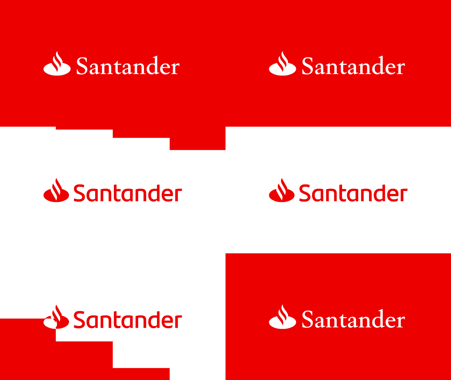
Santander has maintained the essence of the current brand and its primary attributes, including the name, the ‘flame’ and the primary colour (red), however, the font has evolved to make it more slender. The red background has been removed, a brighter tone of red will be introduced that better adapts to digital formats, and the use of white has increased to create greater transparency and simplicity and improve visibility.
The renewal of the brand, implemented by leading global brand consultancy Interbrand, takes place after extensive opinion research among employees and customers in all of the Group’s countries, to evaluate its effectiveness. The conclusion of this listening process was that the brand needed to be refreshed while maintaining its legacy and substance. As a result, the Bank decided on an “evolution, not revolution” for the brand, creating a new image that offers “a better version of ourselves”. It conserves the symbols that relay strength, robustness and trust, but presents them in a more modern version of the logo, adapted to the new environment.
The revision allows both versions of the brand to coexist for a time, so that the change can be progressive. It will start in digital formats (webs, apps, social media and ATMs), as well as in corporate communication and advertising and will later spread to branches, office materials and other physical assets at a pace established by each country.
The flame, which evokes the discovery of fire as a symbol of progress and represents passion and friendship, has been part of the logo since 1986, and was intended for an analogical environment (i.e. for use in branch signage and on paper). Now, it and the font have been adjusted to improve online visibility, better relay the Bank’s digital transformation and compete with important digital global brands.
The Executive Chairman of the Group, Ana Botín, said, “The Santander brand is one of our Bank’s major strengths and is recognised internationally for the trust and credibility it conveys. We have to change and innovate. The brand must evolve too, to accompany our transformation, to be more visible and to convey our culture better”. She added, “For the first time in the history of the Group, there will be a single brand in all our markets. This new brand is more modern and its visibility improves 20% in digital formats”.